Don’t let your competitors win – it’s time to go mobile responsive!
Internet access from mobile devices is constantly increasing in Australia and in many other markets. Almost 69% consumers of the age group 25 to 34 go online with their mobile phones or tablets to send emails, connect with friends or shop online. That's a lot of people who are transferring their shopping experience from their desktop PCs to their iPhones, Android phones or iPads or other tablets.

However, viewing a website from a mobile device doesn't just mean everything is made smaller, the whole page needs to change to make a site usable on either a phone sized screen or a tablet. To achieve that flexibility requires a completely different coding technique from a "desktop only" website, and it allows the website to respond to the user's screen size and resolution, whether that's a PC, Smartphone or tablet device. This results in elements of a page being displayed differently on different devices, some elements will move position on the page, and some elements might be deliberately hidden to make the user experience better.
If you have an existing website, understanding your customer website use profile is an important part of making a decision to upgrade to a mobile responsive website. Google Analytics is a free website performance and research tool that can show the what percentage of your website visitors do so from mobile devices. Most of our clients are surprised at just how many of their visitors use mobile devices, in some cases more than 80% of their customers used their iPhones, Android phones, iPads or other tablets to browse to their pages.
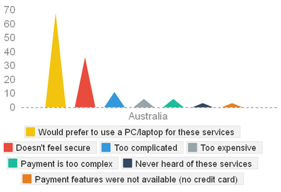
Barriers to Mobile Commerce Still Exist
As a survey from Ipsos Media CT, in cooperation with Google Australia, implies, 38% of the respondents expect to use their Smartphone more to access the internet in the future.
However, there are still barriers to mobile commerce as the graph below shows.
Barriers to Mobile Commerce Still Exist
Barriers to Mobile Commerce Still Exist
Ensuring your website is mobile ready is an important element for success in the competitive marketplace. It will help your website engage with more visitors, keep them on your site longer and most likely increase conversions. If your website doesn't display well for your users on their mobile device, they will leave your site quickly and look for sites that are more appealing. If your competitors' websites are mobile ready and easy to navigate on Smartphones and tablets, then that could be where your customers go.
What do I do now?
If you are building a new website from scratch, then you should ask that it be built as mobile responsive at the start of the project.
If you already have a website:
- Analyze how many users visit your website with a mobile device
- Upgrading to a mobile responsive website is a good opportunity to maybe refresh your website design.
- Focus on creating a good user experience on mobile devices, to ensure that your mobile site converts as well as a desktop.
- Simple, attractive and easy to navigate websites tend to be very effective on mobile devices.

Co-founder and Managing Director of SiteSuite Australasia, Australian pioneers in web design and ecommerce since 1997. For more from Chris you can follow him on Google+ or Twitter, and for further professional musings and thoughts on his other passions in life, www.chrissutton.com
- Product News (10)
- Ecommerce (19)
- Web Design (11)
- Digital Marketing (39)
- Website Content (24)
- Blogging (9)
- SEO (20)
- Getting Started (6)
- Social Media (10)
- The Guest Blog (10)
- Observations (2)
- Videos (5)
- Security (3)
Don't Miss Anything
Get email updates when the next blog is posted.
Ecommerce
Web Design & Development
Online Marketing
by SiteSuite
Everything you need for online success